Comic Title: Tales of Tears (Volume 1)
Artist: Setor Fladzigbey
Managing Editor: John Schaidler
Story: Kobe Ofei
Publisher: Kugali
Synopsis
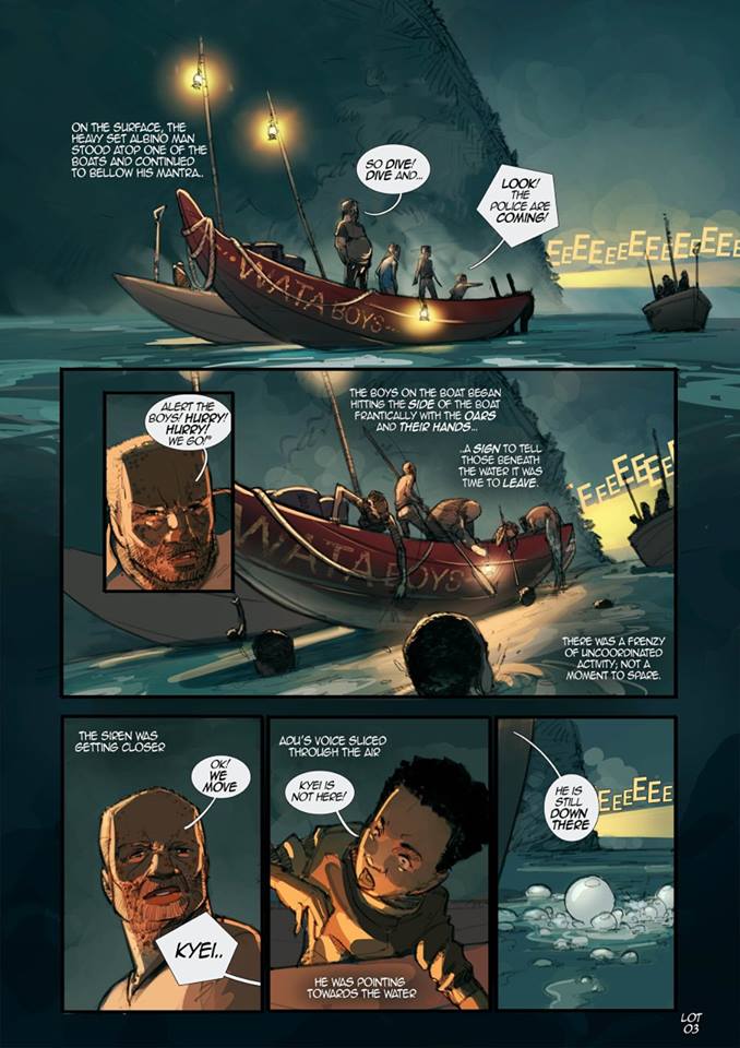
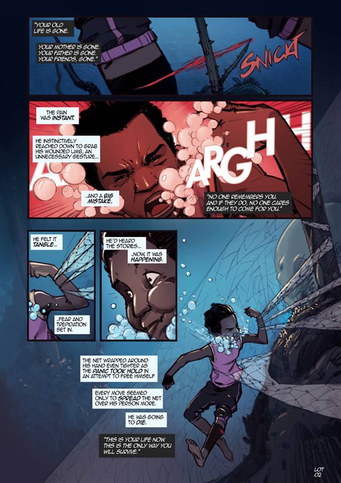
The story follows Kyei, a young boy who dives underwater on a late-night fishing trip but gets caught in a fisherman’s net.
Struggling to free himself, he soon realizes his fellow crew have abandoned him as police patrol boats close in.
Left behind by his captain, Opanyin, Kyei begins to drown until an unknown force propels him out of the water.
Rescued by two mysterious children, Kyei is offered a choice: return home and act like nothing happened, or follow them and change everything.
The issue ends abruptly, leaving readers with more questions than answers.
Story and Writing
At its core, Lake of Tears #1 has an intriguing setup: a boy trapped between survival, betrayal, and something supernatural beneath the waves.
Unfortunately, the execution doesn’t fully deliver.
The narrative raises far too many questions without grounding the reader. Why is their fishing illegal? Why are the police after them?
Why would Opanyin abandon Kyei only to later regret it? What mysterious force saved Kyei, and who exactly are the children that appear at the end? While mysteries can be a powerful hook, here they feel less like intentional suspense and more like missing pieces.
The storytelling also relies heavily on caption boxes (the storyteller’s voice) layered with character dialogue. Even though different colors are used, the sheer volume of text per panel makes it distracting.
A more focused approach, one strong caption or line of dialogue per panel would have made the pacing smoother.
Artwork
If the writing falters, the artwork shines. Setor Fladzigbey’s pages are beautifully composed, with strong anatomy, fluid storytelling, and effective paneling.
The action sequences are easy to follow, and character expressions feel authentic. This is where the comic truly grabs attention.
Colors
The colors are another highlight. Rich, vibrant palettes pull readers into the world of the sea and the night sky.
The tones capture mood effectively, creating contrast between the bleakness of Kyei’s underwater struggle and the more hopeful scenes above. The coloring is not just attractive—it elevates the book’s atmosphere.
Lettering
Lettering is serviceable but unremarkable. While legible, the balloon designs and text placement could use more polish.
Given how much text is squeezed into some panels, clearer spacing and more variation in balloon styles would have helped ease the reading experience.
Final Verdict
Tales of Tears #1 (Dark Waters) is a visually stunning comic weighed down by uneven writing. It builds intrigue with its premise but fails to ground the reader in its world or characters, leaving the abrupt ending unsatisfying.
The strong artwork and coloring save the book from being a total misfire, but the writing needs much tighter focus to match the quality of the visuals.
Score: 3/5 – Gorgeous art and colors, but the story leaves readers more frustrated than hooked.